QLIK SENSE – Février 2019
What’s new in Qlik Sense February 2019 ?
Usability Improvements
Single page application flow
Qlik Sense now has a single page application flow. You can move between Data, Analysis, and Story spaces without reloading the page. This creates fluid and natural navigation for end users and developers, with fewer clicks and faster time to insights.
Advanced Authoring
Dollar-sign expansion preview
The expression editor now provides a way to evaluate the results of calculations with dollar-sign expansions. Developers who use variables can see how these work in the context of an entire expression. This reduces the chances of having the wrong syntax in nested expressions.
Visualizations and Mapping
Visualization Bundle
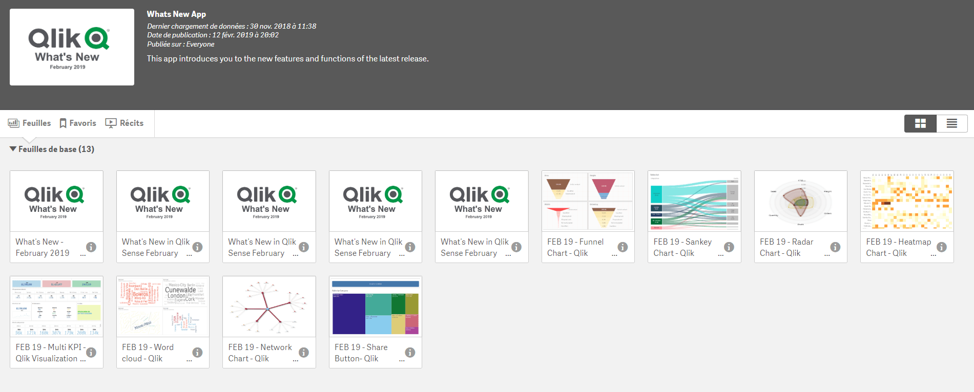
Visualization bundle is a set of new charts:
- Funnel chart: shows progression of a measure through stages.
- Sankey chart: displays a measure as flow, and how the measure is divided into different categories in one or more stages.
- Radar chart: shows a measure spread on polar chart with two category dimensions, one for the axes and one for areas.
- Heat map chart: shows a matrix of color values with two dimensions and a measure.
- Multi KPI: shows measures with more options and customizations than the standard KPI object.
- Word cloud chart: highlights the most common occurrences in a text dimension.
- Network chart: visualizes a graph with dimensions for nodes and parents and measures for link values.
Dashboard Bundle
One extension added to the existing bundle:
- Share button: creates sharable app links with current sheet and selection.
